

Why Should Your Website Be Responsive?
You may have heard the word “responsive” floating around website development circles. What does it mean, and why is it important?
Back in the 90s, it was pretty easy to build a website. Everyone who accessed the internet did so from a box-style computer whose monitor displayed at the same screen resolution as every other computer on the market. Everyone built their website to display the same way on every device because every device in the world displayed things more or less identically.
Different Screens Display Content in Different Ways
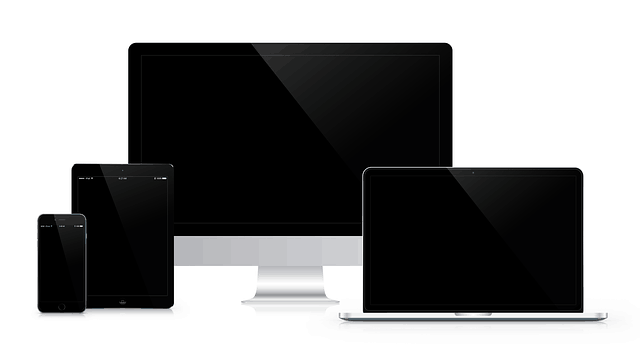
Today, most people view the internet primarily from their smartphones. No two phones have exactly the same screen size. Consumers expect a seamless experience when setting down their phones and moving to their tablets, laptops, and computers.
From the graphic art students at CalArts on their giant-screened iMacs, to the small business owners on Main Street who shuffle from task to task while glancing at their smartphones, website responsiveness makes sure your site is usable and beautiful on any device in Santa Clarita’s many homes and businesses.
A user can view a responsive website on a computer or a phone, with different results. On a computer, content will fill the screen in a lively manner. However, when viewed on a phone, the website reorganizes itself to prioritize important information and site navigation, hiding items that might clutter a smaller screen.
Responsive Design Responds to its Environment
In other words, a responsive website “responds” to its environment — showing a mobile-friendly version to mobile users, and a computer-optimized version to people viewing on larger screens.
Big tech companies spend lots of time and money building the best possible user interfaces for a reason. Whether in Silicon Valley or right here in Santa Clarita, consumers who are forced to read tiny text and try to navigate cramped menus will get frustrated and find a competitor whose software is easier to use.
The same thing is true for your website! Northern Lights Gazette is a terrific example of a responsive website.
Now that the majority of web traffic comes from smartphones, users have made it clear that they won’t stand for sites that don’t work well on smartphones. In fact, Google now penalizes websites that aren’t responsive! Google site rankings are important for website traffic, so it’s important for businesses to keep in Google’s good graces with responsive web design.
You absolutely don’t want to lose customers because your site doesn’t work well on mobile. Responsive websites keep users’ attention by improving their experience based on the device they’re using to view your content. KHTS Marketing can help you build a beautiful responsive website today!

